I am eager to begin the Roarin’ 20s with a better photography setup, which should improve the blog posts. What did I do? Well…check it out.
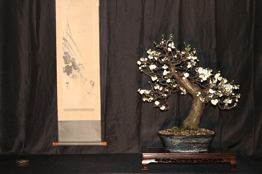
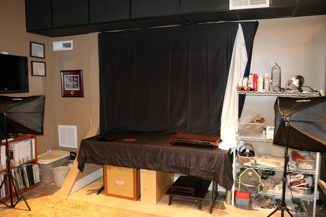
I have used a rather primitive setup for years…effective, but annoying at times too. The setup consisted of a Costco folding 6’x3′ table, a black sheet nailed to the wall, and a clamp-on floodlight if I need more light. The folding table was crowned in the center, so trees tended to lean toward the outside. The black sheet was fine, but the wrinkles could get distracting, and the clamp-on floodlight definitely wasn’t enough.
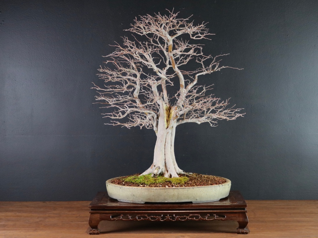
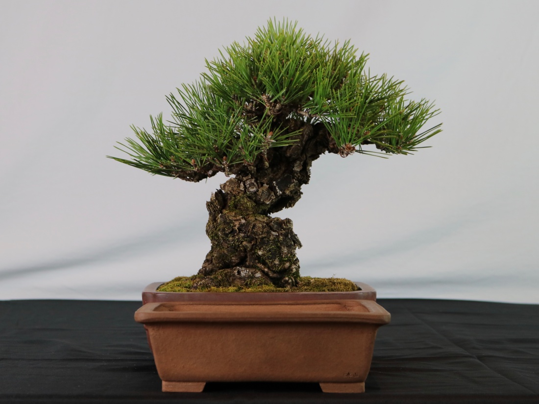
I closely-crop my photos to show the tree:
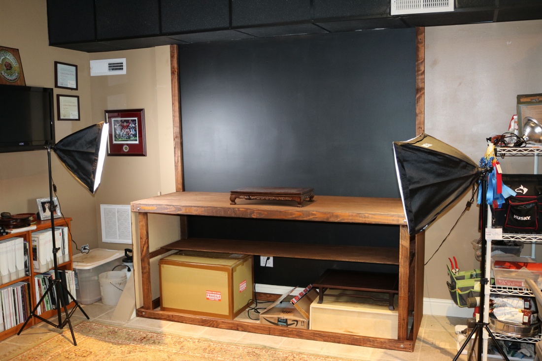
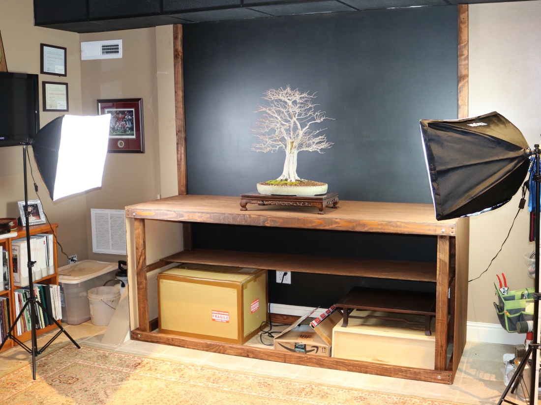
And not the whole wall…
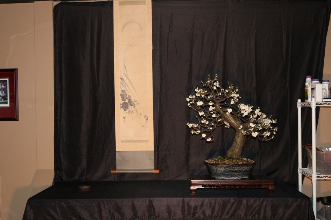
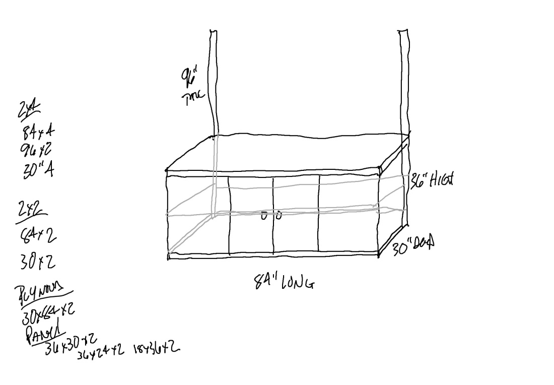
See why? The Costco table is 30″ tall, and I like to display and photograph the trees at a higher level. Traditional tokonoma displays place trees at knee level or lower, meant to be appreciated while reclined. I don’t really do that in my studio, and I’d like to add a little storage under the viewing counter. I thought about the build for a few months, saved off a few images, and began to design.
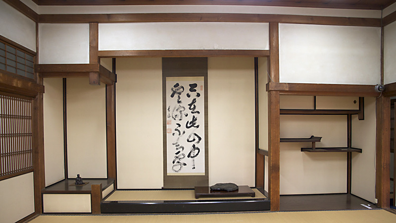
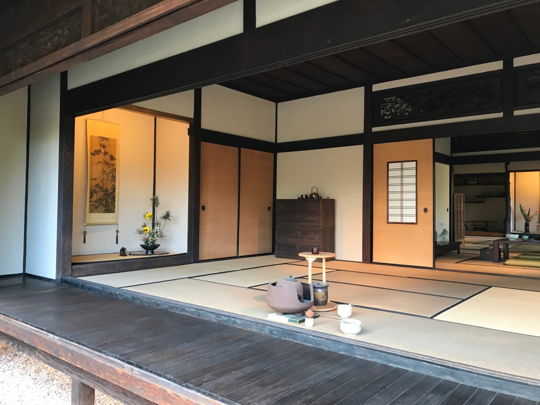
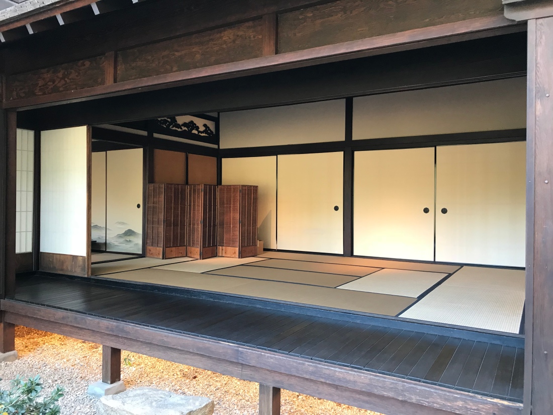
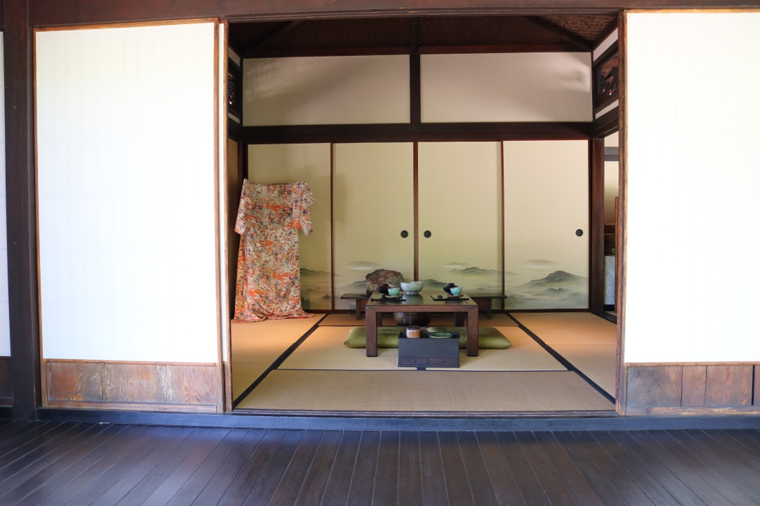
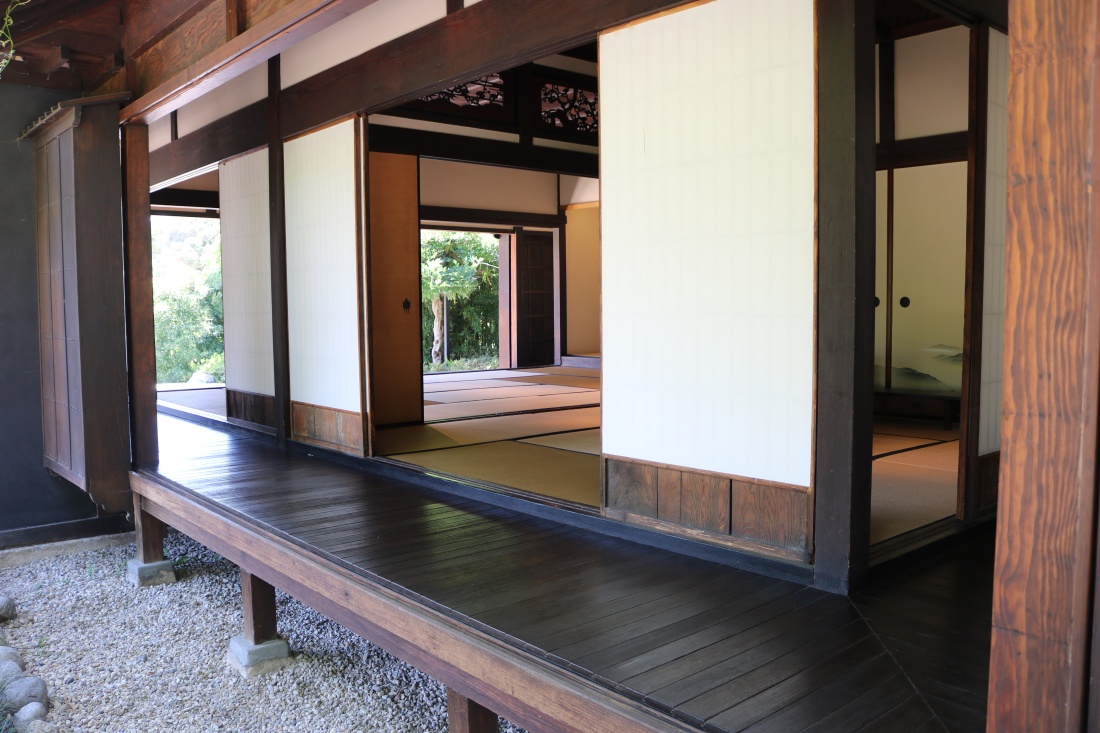
The photos below are from the Tea House at the Huntington in San Marino CA. If I recall, it’s over 300 years old, and was brought over from Japan and reassembled on property. This house is a special place, and I wanted to incorporate a few elements in my nottokonoma. Make no mistake, my carpenter skills are not good, bad actually…so the “elements” I’ll incorporate may be rather abstract. Use your imagination…
Back to reality…Here is the sketch I worked from:
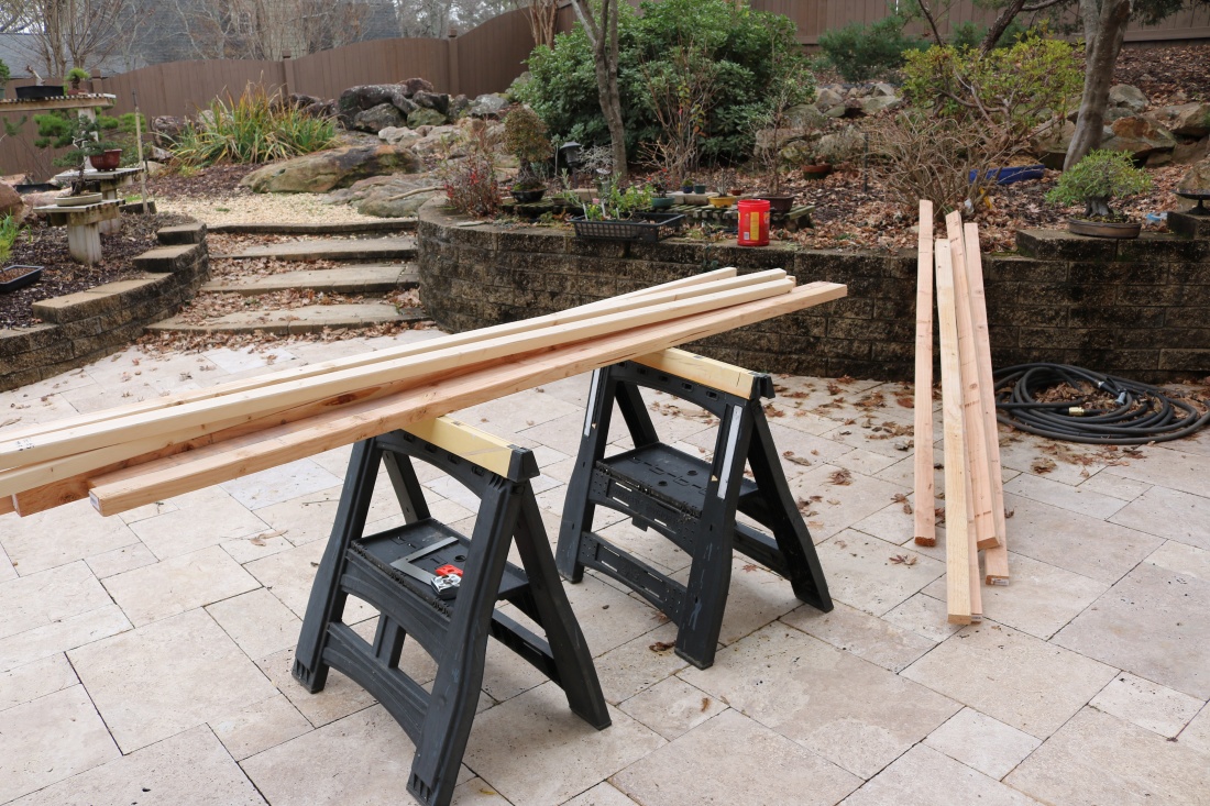
And during the winter break, and while sick with the flu no less, the redneck photo booth came down…
And construction began.

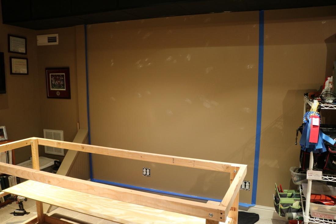
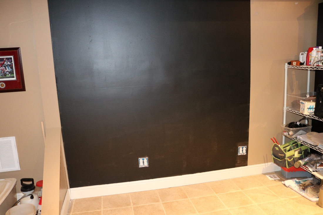
I taped off a 7′ wide section of the wall and painted it with chalkboard paint, hoping it would result in a very dull finish that would absorb flash light and not reflect it.
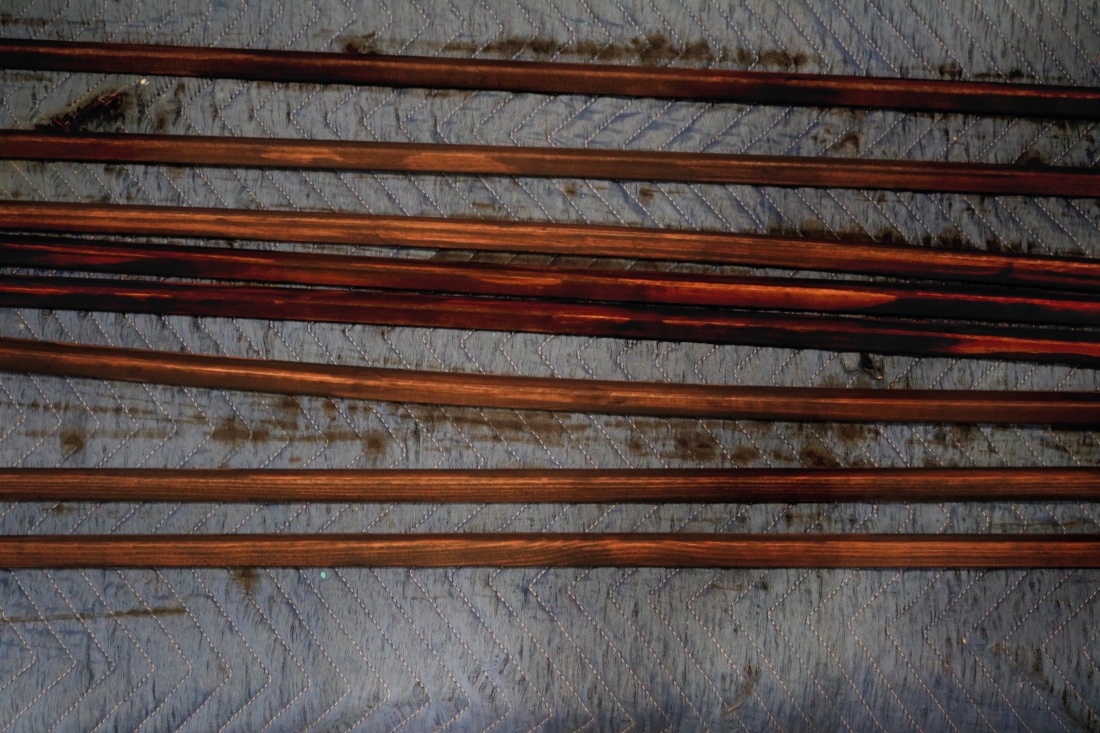
The stain color is “special walnut”, which seemed close to the wood in the two photos, maybe a tad warmer, and still without red tones. I stained everything, in case I change my mind later about how it is covered.
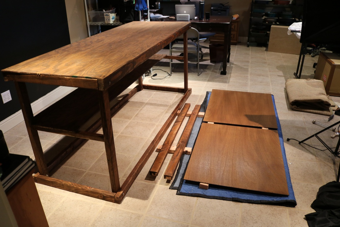
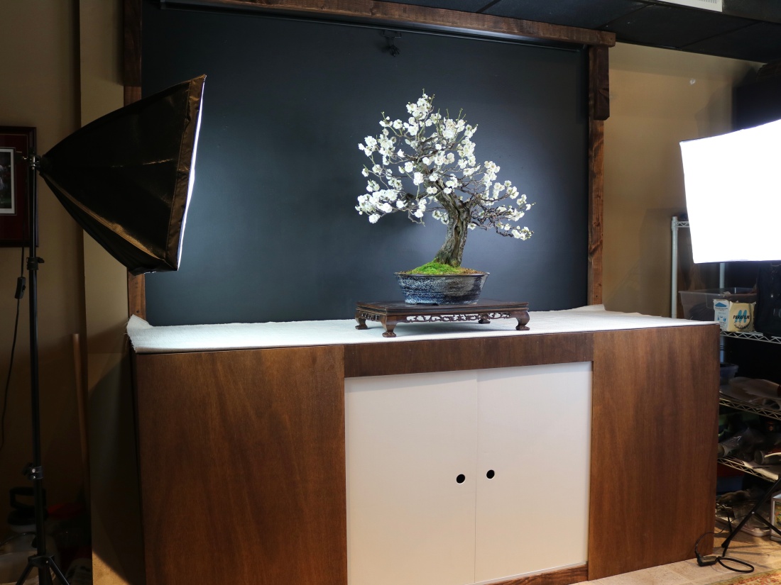
The front will be stained ends, and light-painted doors with finger holes in the middle (reminiscent of the tea house doors). Set up for a few test shots:
Cropped:
That should work.
Now, on to the front panels and doors.
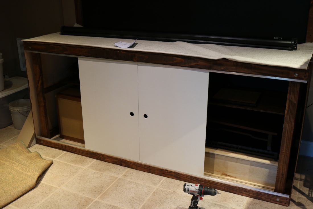
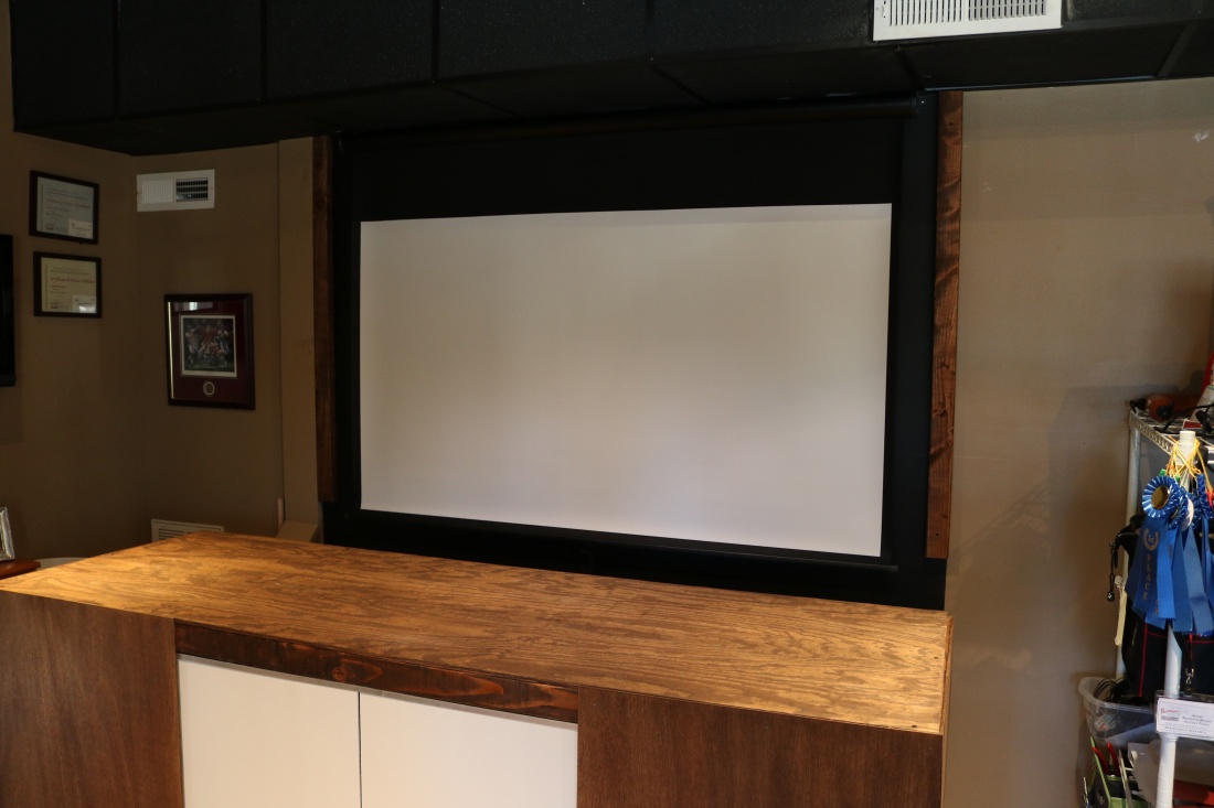
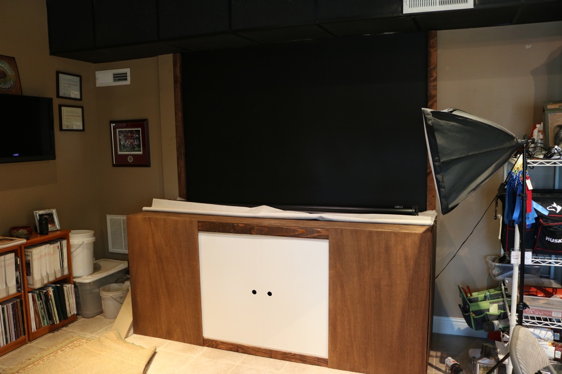 Next, a roll-down projector screen to give a white backdrop option. I’ll hide that behind a canopy which will suggest the alcove element of a tokonoma.

Trim piece to hide the upper cabinet door guide:
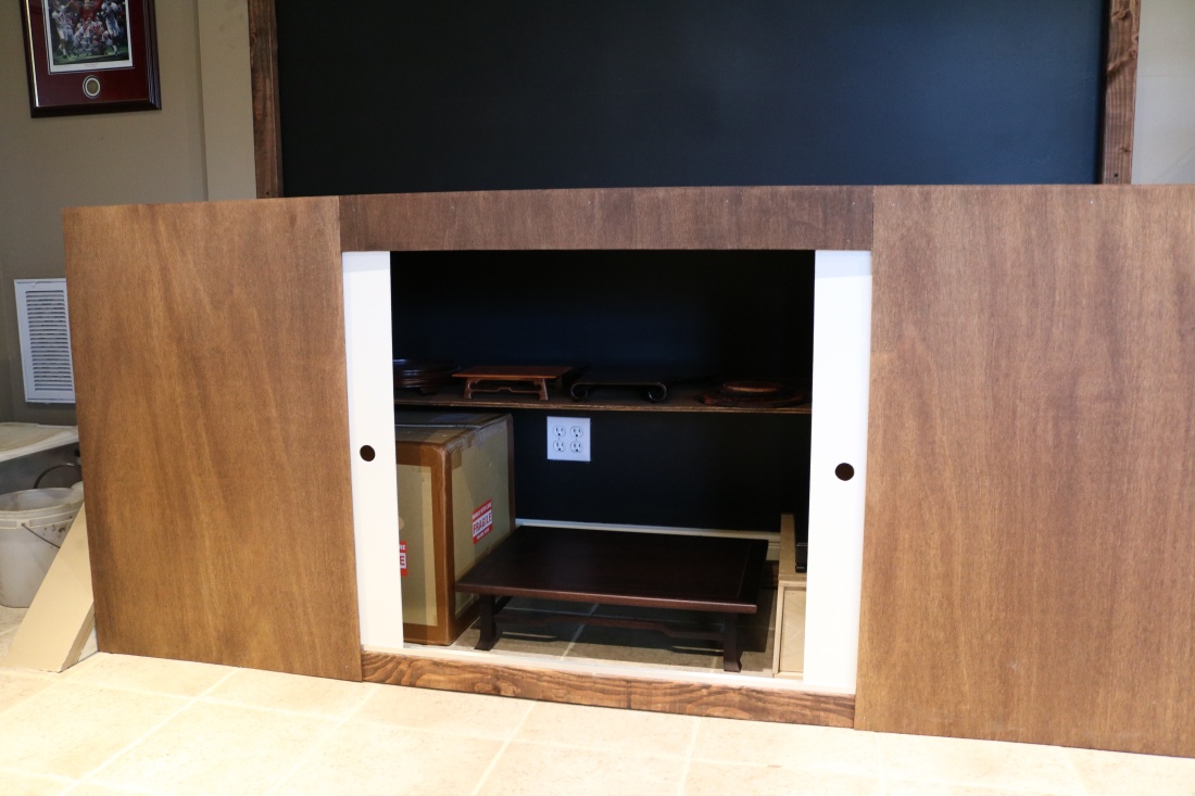
And closed…

Next up, some trim pieces to frame the top and front corners. I wanted these to be just a touch darker, so I added some Espresso color stain to the Special Walnut, 1:3. Not distracting, but just a touch of detail.


At some point, I may add sides to elicit some of the tea house tokonoma feel, but for now, it’s good enough to use for photography. I will also keep my eye out for a good straw or rush mat to use in place of the fabric. I considered tatami mats, but would prefer something thinner. Any suggestions, feel free to leave a comment.
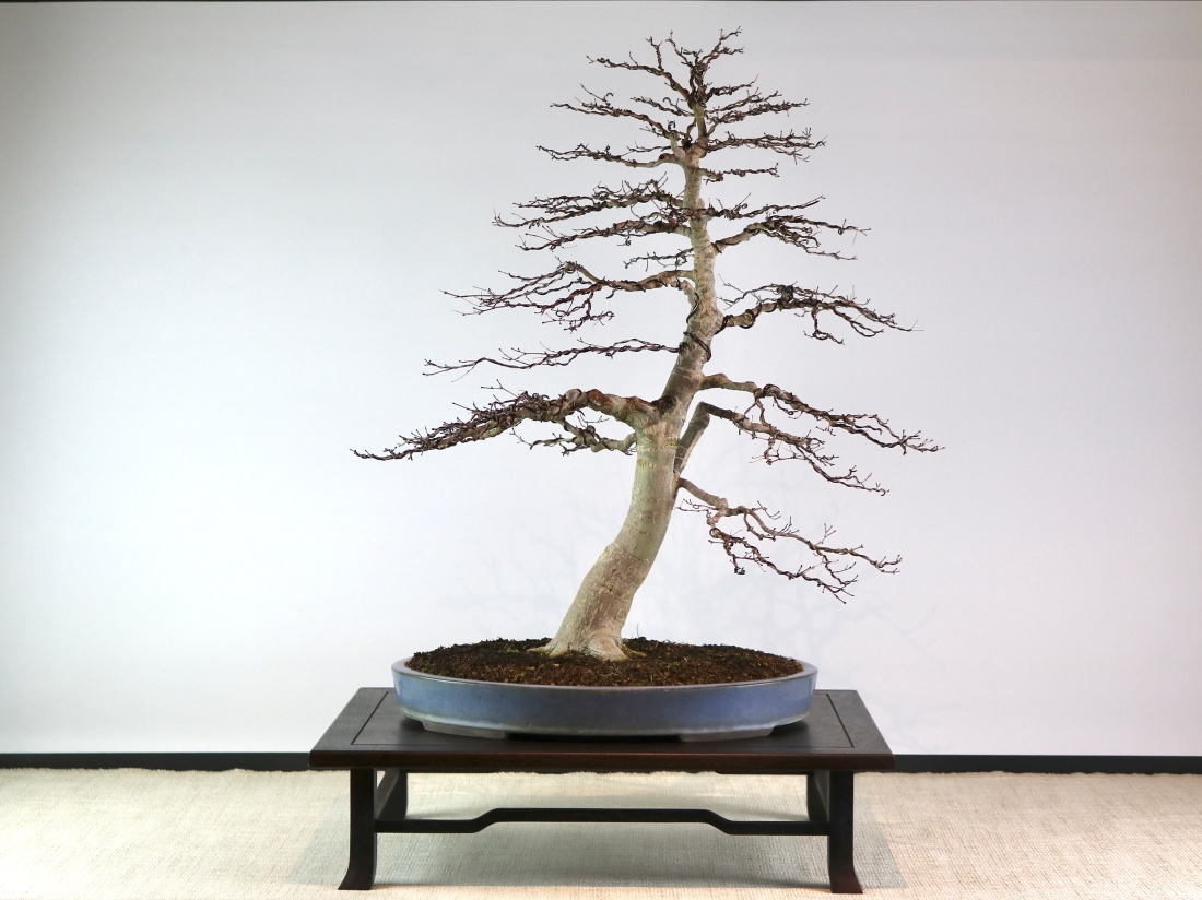
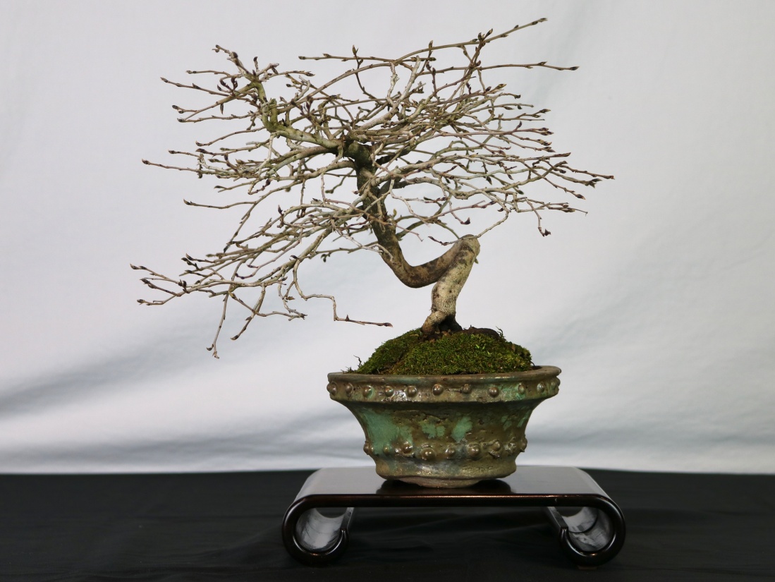
Since it’s New Year’s Day as I write this, here is the Ume in full bloom, a nice upgrade from last year’s photo.

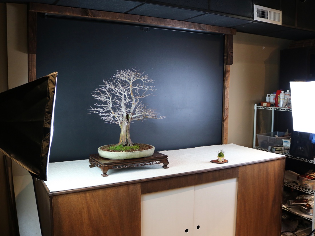
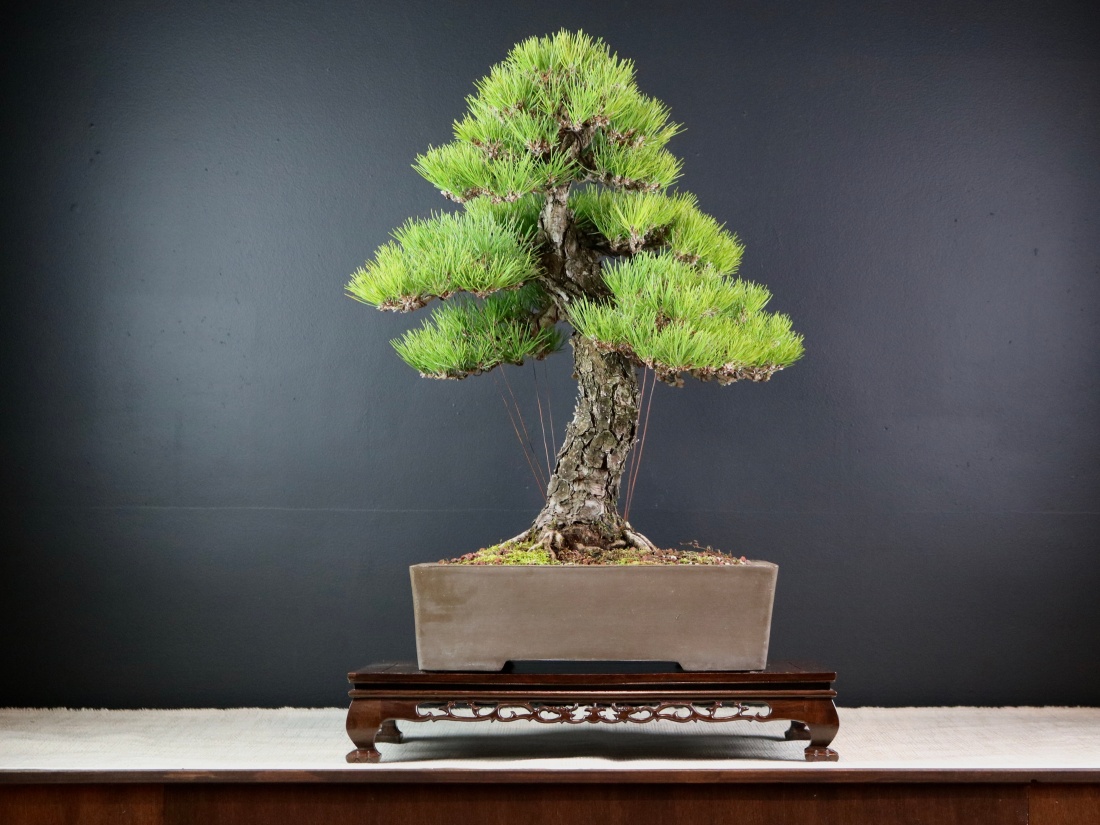
And playing around with the black vs. white backdrop. Black is good for showing the silhouette, white is good for showing detail.
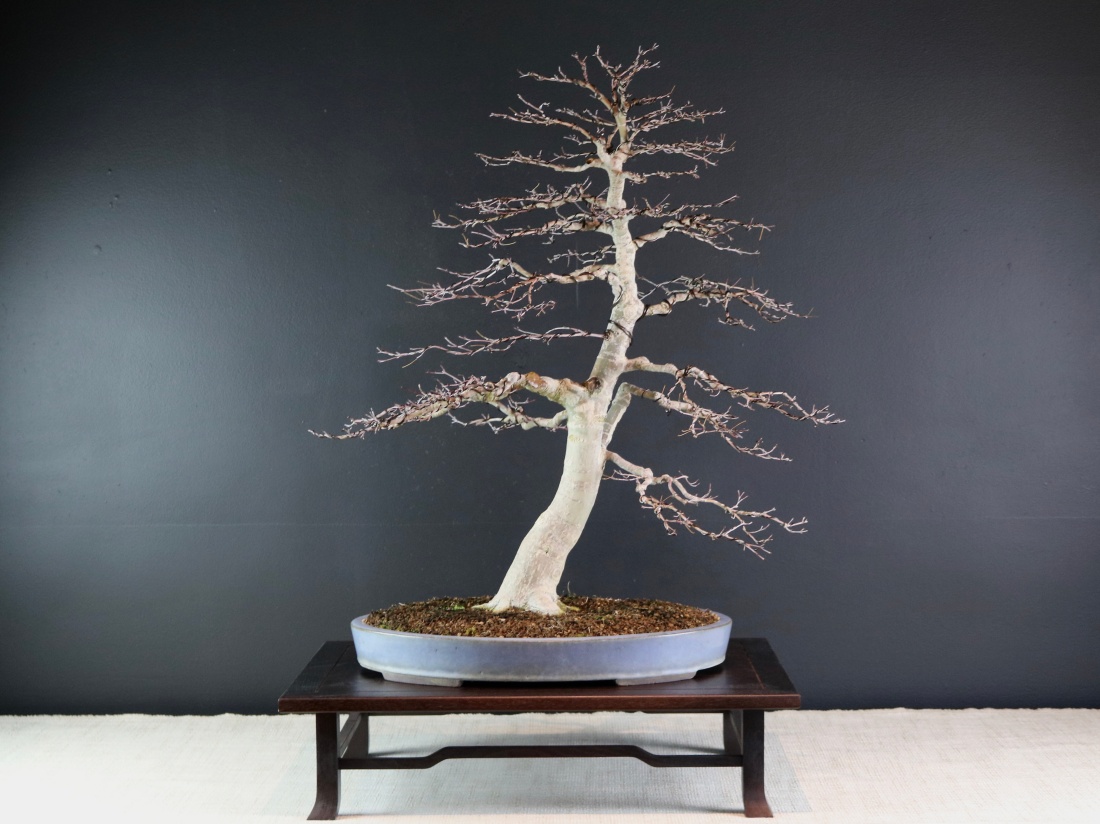

I look forward to sharing lots of photos of the new nottokonoma in the posts to come!

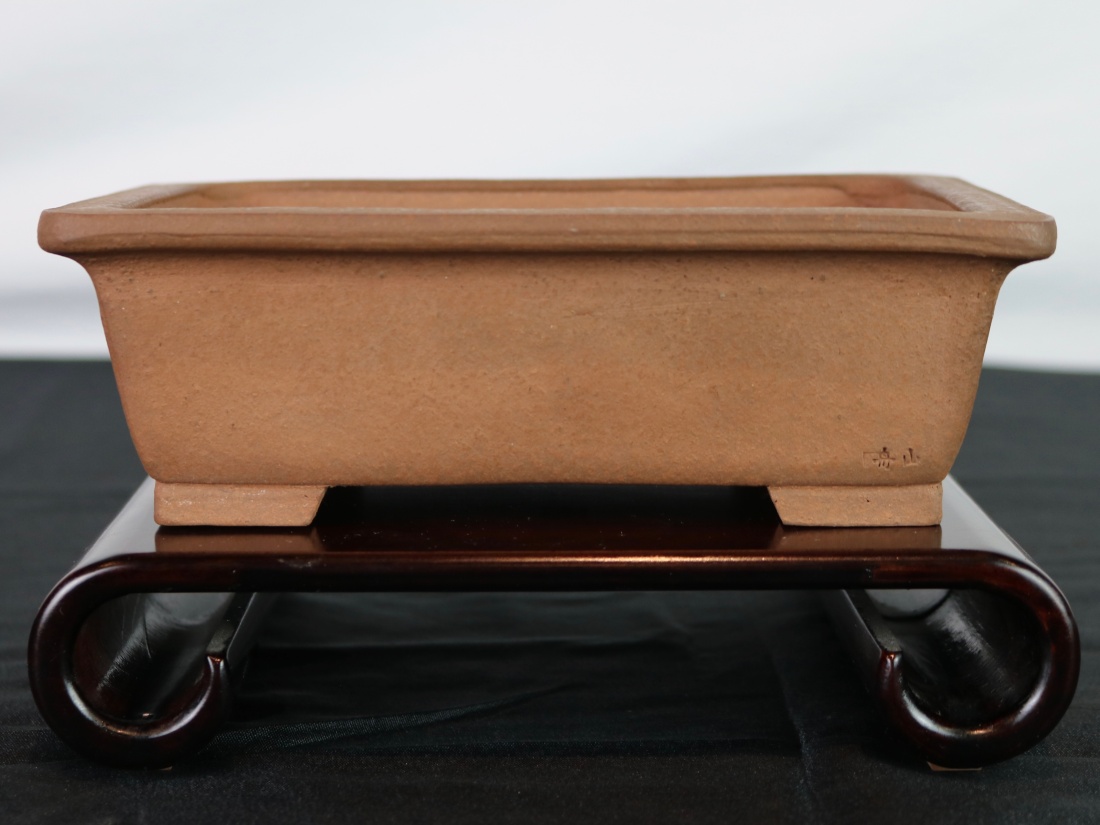
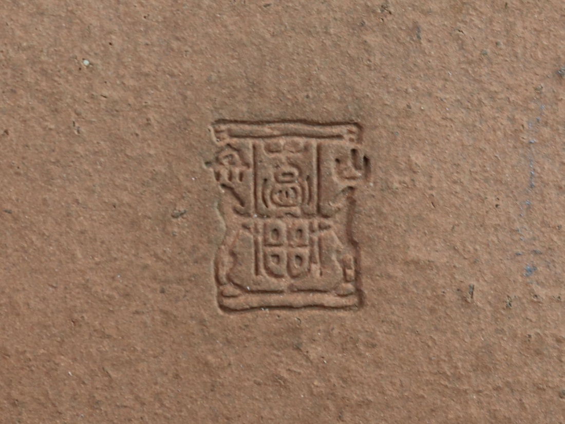
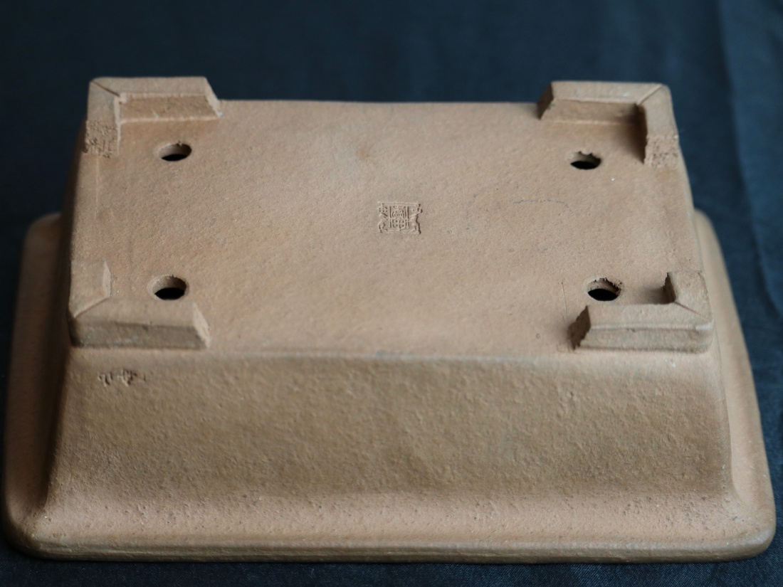
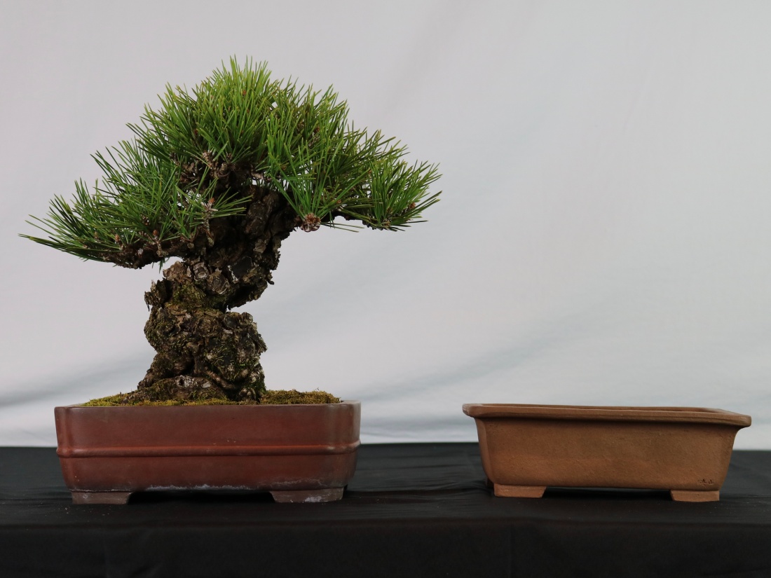

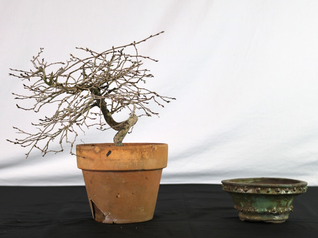


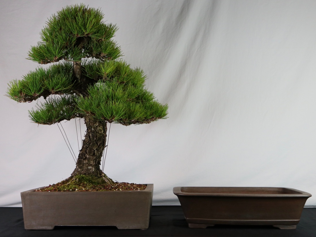

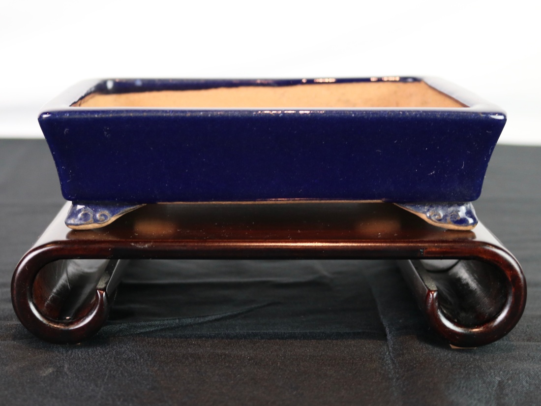
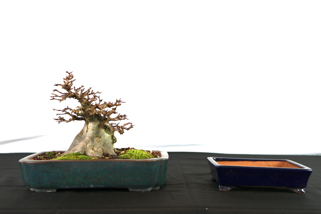
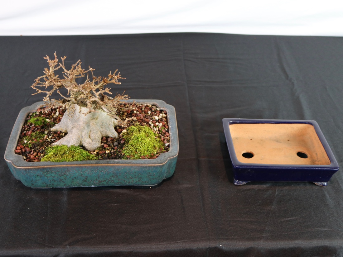
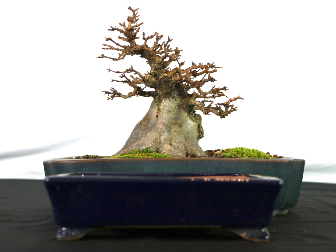
 This Ikkou (Tokoname) is 7 3/8″ wide, and should just work. I’ll be sure to post some shots of the shoehorn-style repotting in the spring.